One Psychiatry Office
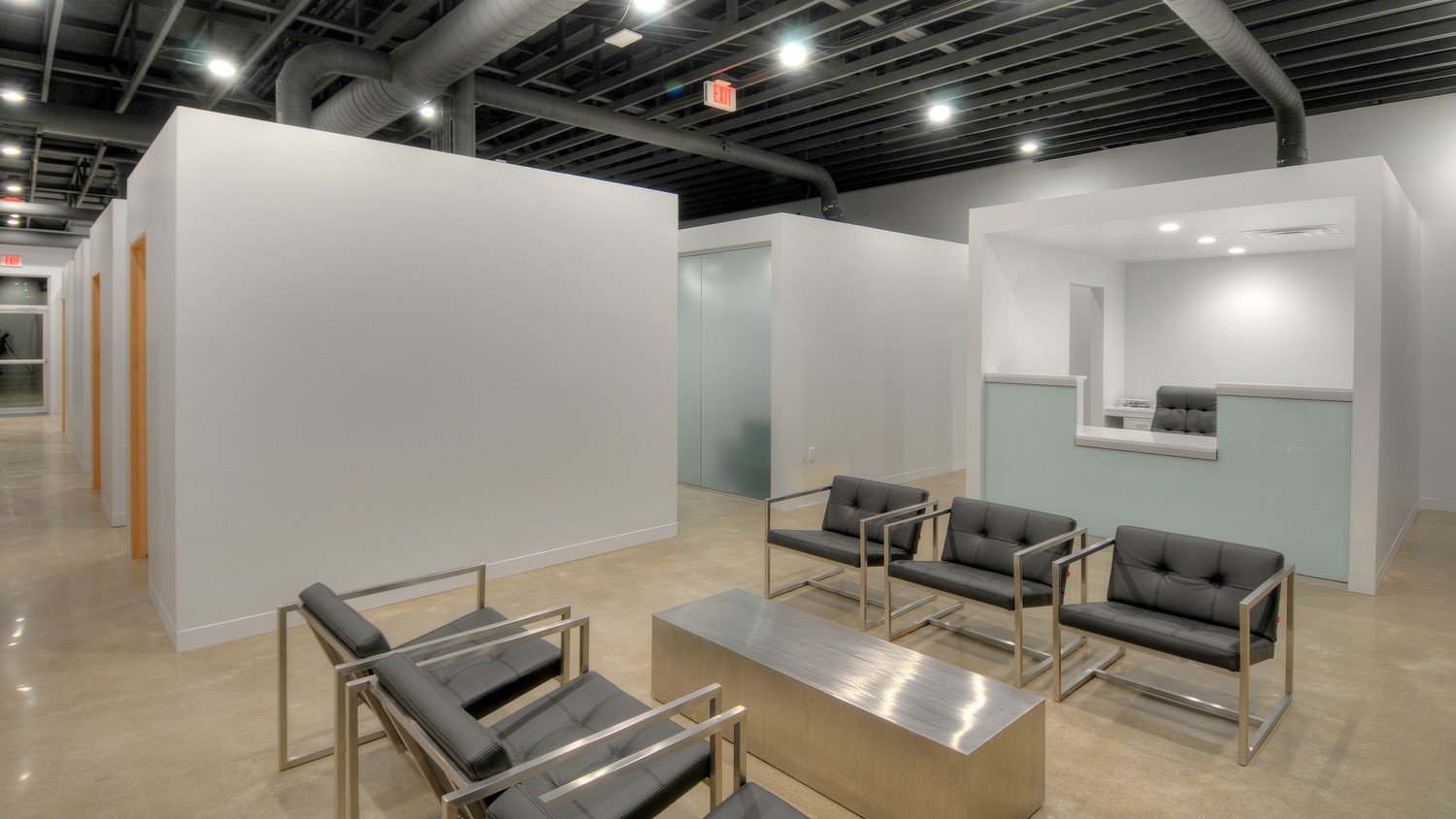
The Client/Psychiatrist believes that design affects the occupants/patients. Three strategies were developed creating a build-out with a sense of everything being in its place.
De-clutter:
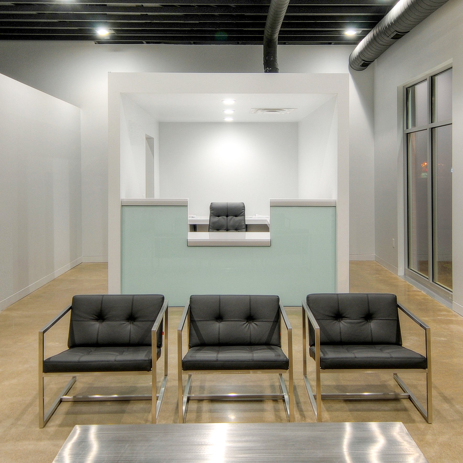
Remove superfluous items, reducing visual noise and other distractions. Simple tectonic and monochromatic forms were developed to achieve the $80PSF budget.
Equality:
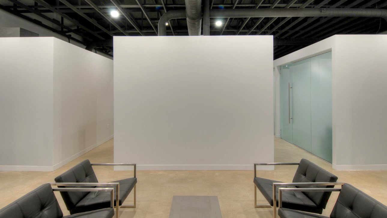
Create order by eliminating elements of differentiation - organize uses with same-size offices and so on into separate rows. Each space has a value and thereby form; so even a mechanical closet has its own stand-alone volume. Each row shares common denominators like height and color. So, a restroom and consultation office have equal visual presence.
Connectivity vs Privacy:
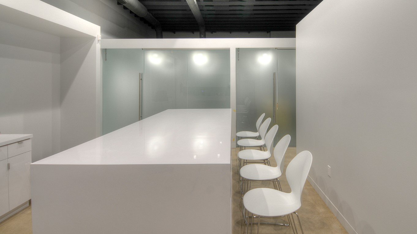
This strategy creates a hierarchy of privacy that’s expressed beyond just where a space is relative to public spaces. The reception desk connects open-air to public spaces. Consultation offices with translucent walls screen view while allowing light to be shared between the circulation space and office spaces. The hope is occupants in consultation will feel as though their conversation is private while feeling less claustrophobic. Procedural suites are opaque forms, fully disconnected from public view. Materiality can create privacy while still creating a “feel” of connectivity where desired.


