Pioneer Bank
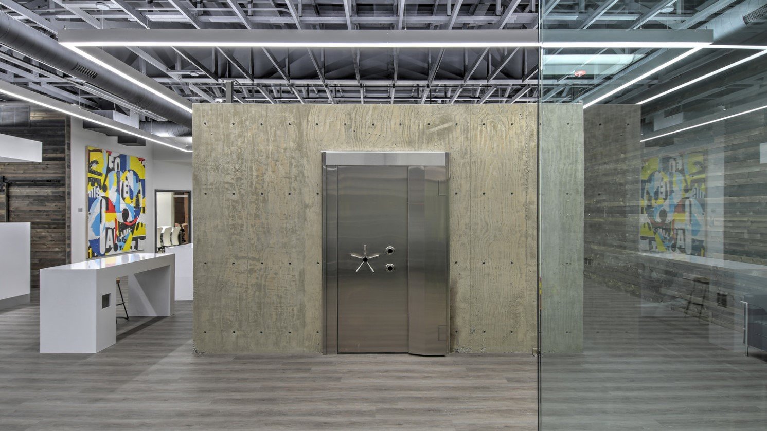
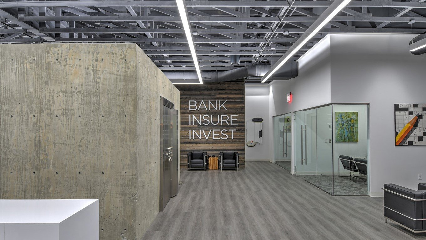
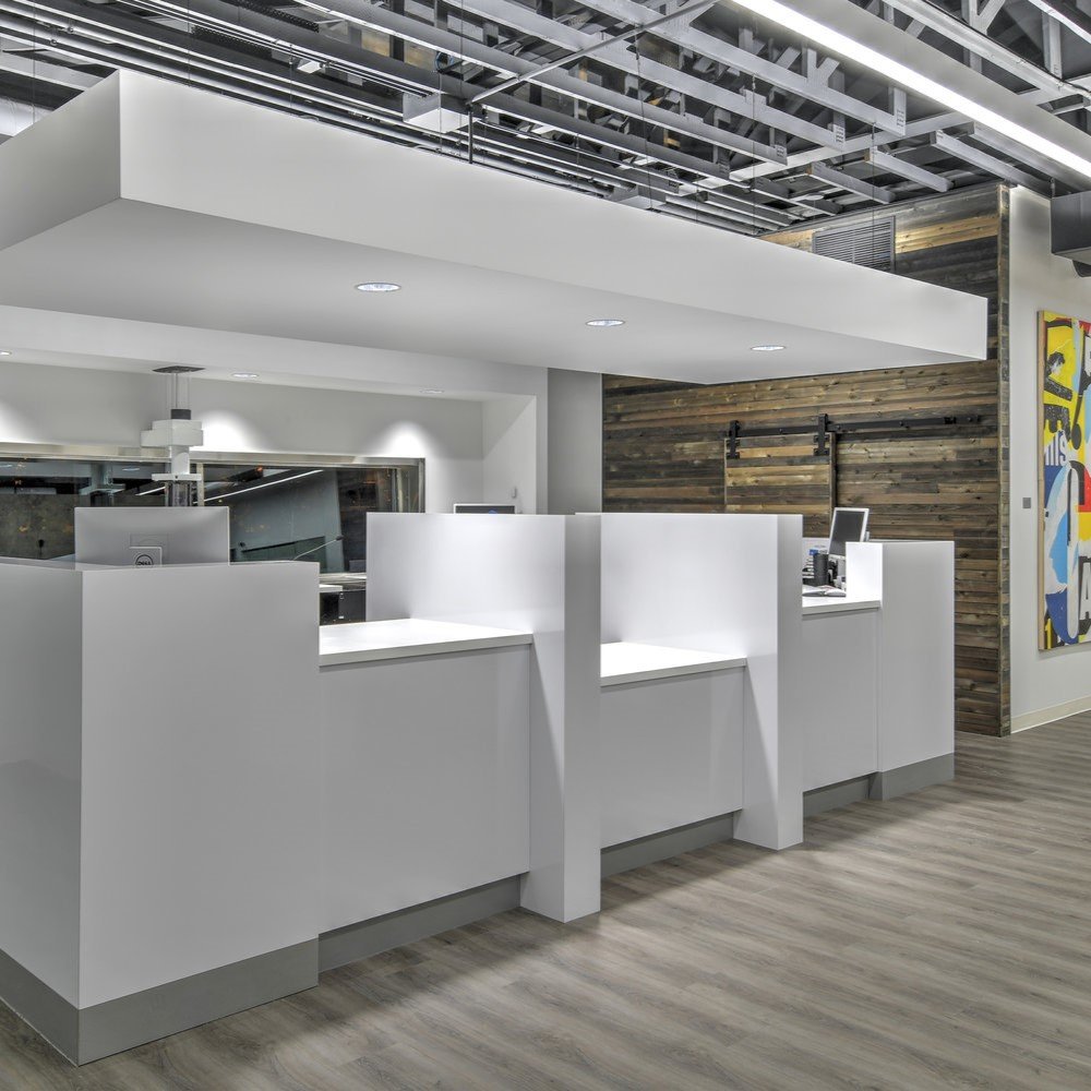
The interior build-out considers what signifies a bank lobby to a customer. The bank’s parti is intended to intensify those customer-focused experiences. To achieve this in part, a series of customer-focused stations such as the teller desk, the vault, and wait desks were placed in the center of the lobby surrounded by other support spaces.
To create a sense of increased intensity around those experiences, a gradient was developed locating spatial events based on customer-usage.
1. Spaces that are largely focused on the customer.
2. Spaces that are utilized more evenly by the customer and the bank staff.
3. Spaces that are utilized almost entirely by the staff.
First Gradient:
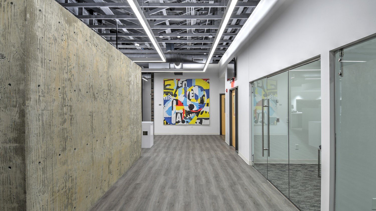
Unavoidably centered when a customer walks into the space, is the cast-concrete vault which provides a sense of weight and permanence supporting a sense of security. The in-the-way placement of the vault creates tighter more defined spaces for increased interaction and movement vs a more typical expansive bank lobby. Wait desks are located between the vault and teller line for deposit paperwork or waiting for assistance. Both the wait desks and teller line utilize well-lit white forms to contrast from the surrounding space. The isolated forms and finishes of the stations help to intensify customer experiences as stand-alone, dedicated forms. The idea is that one could remember with specificity the form of each customer-focused activity.
Second Gradient:
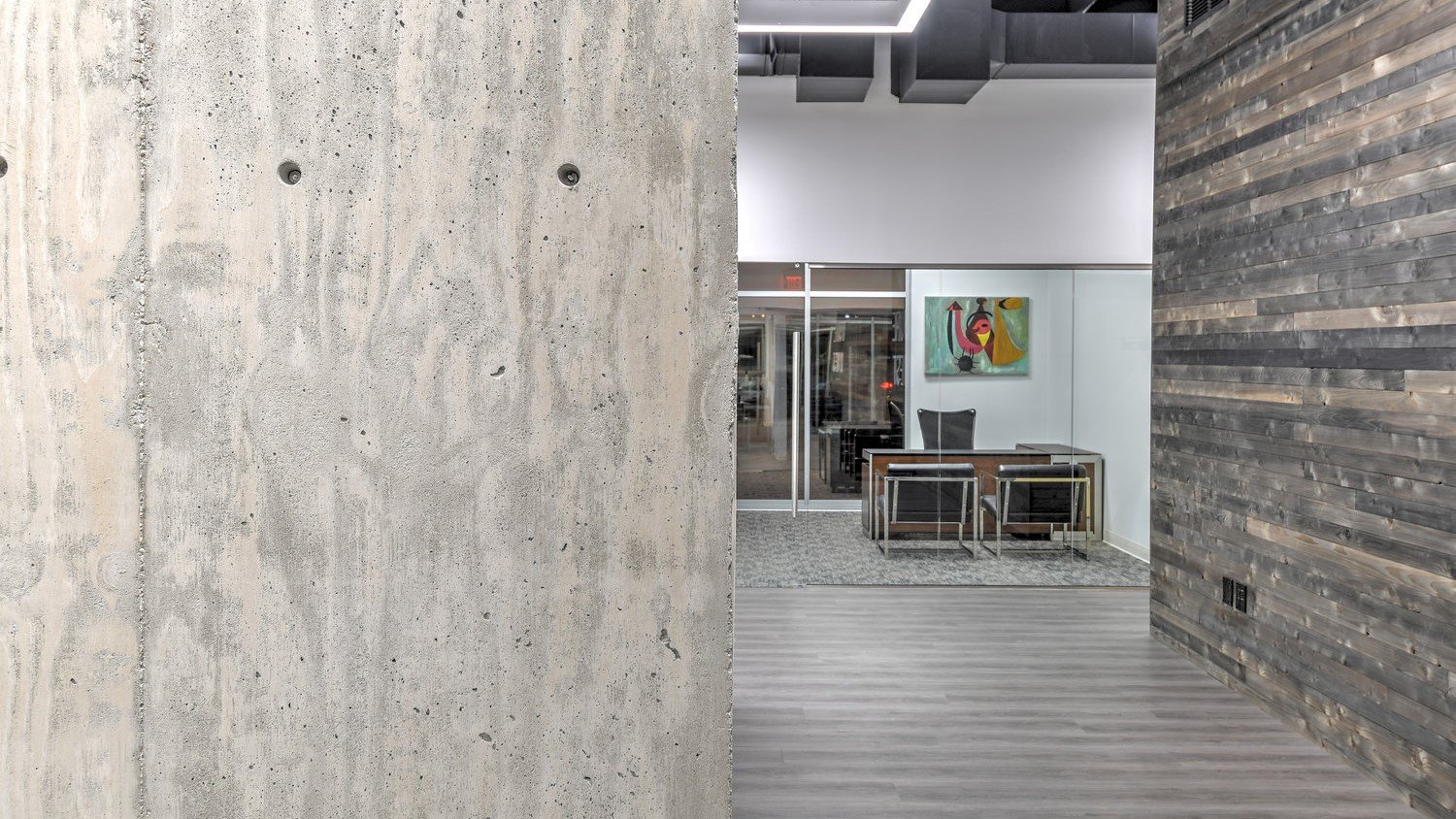
Offices are located around customer activity stations. These spaces utilize glass partitions to promote a sense of transparency and connectivity. Each office has a direct line of sight to the vault which signifies a primary purpose of the bank; to securely store their client’s assets.
Third Gradient:
Support spaces utilized by staff such as a coin counter room or IT room are located at the outer edges of the space with opaque walls.

